Packaging Design Agency
Large Product Ranges: Packaging Design

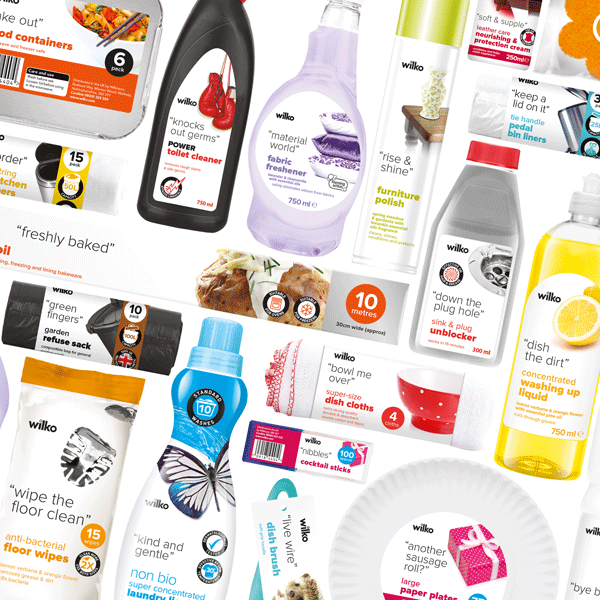
Your packaging design concept looks great, the brand positioning has been signed-off, and master design elements are created. The challenge is how to apply the creative across your extensive product range with consistency that respects the integrity of the original vision.
But how to do it?
Does one size fit all?
Unless your extensive product range only consists of packs of very similar size and shape, then you will need to build an artwork roll-out guide that allows for these variations. A well thought out sizing structure that includes variations for brand logo and key elements such as text, callouts, supporting graphics that can accommodate different pack sizes and formats is the key to maintaining design consistency across your range. Most of the time, this structured approach to brand asset sizing is a great starting point for implementation.
But sometimes, extreme differences in pack heights, widths, formats and sub-straights are a factor. Without the correct design application, a packaging range could appear to be disconnected and jumbled from each other. For example, even by following the packaging rules, some graphic elements may not visually line up from one pack to the next when they are on the shelf together – breaking that brand harmony that we are looking to achieve. The solution is to use the established guidelines as just that – Guides. These guides will allow room for those packaging “problem children” or that poorly positioned product window or a completely different packaging format with a different set of print requirements.
Design with flex
Sometimes the established design rules need to be flexed to maintain a visually consistent look across the range.
Packaging rules can create visual formulas to good effect. They speak about measured graphic ‘zones’ or colour block ratios, but sometimes it needs more than a binary answer. It often requires a subtle hand to make it look and feel harmonious. An unmeasurable element that maintains a consistent design rhythm across the range but without eroding the integrity of the design. The key is to incorporate this deft touch into the packaging so that consumers don’t even notice – they see a cohesive range that looks and feels right!
Regional Variations
Many overseas territories will have regional requirements. Sometimes the need for multi-lingual information, variations in photography, maybe regional sensitivities around certain words and colours. All these factors can start to harm the original master design. These challenges can be skillfully designed into your packaging to look like intended.
Legals
A word that no packaging designer likes to hear. It can often mean compromise – unbalancing the pack’s aesthetic with something that gets in the way (look at the front of any U.S toy packaging or the back of a food product to see how compromising these can be). But as the word suggests, they are a mandatory inclusion for the front of the pack and are here to stay – indeed, in the future, they are sure to be more prominent. They may someday contain even more information than they do now. Meaning they will need careful consideration to maintain consistency, at the same time to compliment the brand’s design look.
Future-proofing
New products are likely to be added with a range, whilst others may be de-listed. The artwork roll-out guide is ready to address any new pack formats and shapes that need creating. But this constant re-shuffling might start to fragment the range. Products might require slightly different messaging than the original because the market has moved on. Maybe research has shown that the hierarchy needs adjusting or that there’s a need to change colours to reflect the category better; perhaps it’s now challenging to tell products apart from each other. Throughout the life of a range, these vital changes to individual packs or small sub-ranges will need consideration. Brand stewardship that considers the whole range will build and maintain a more robust, cohesive brand look.
To sum up
The key to successful brand implementation across an extensive product range is leveraging the flexibility of the original creative and challenging its robustness to accommodate the differences in pack shape, structure, and content. Doing it will help create a cohesive range on the shelf and a range that is also on-brand now and in the future.
Featured image:
Wilko Home Cleaners.
A range that initially featured over 600 product lines with more added each season.
Guideline creation for the Brand Range, Artwork Application and Print Guides for each product vendor – All helping deliver cohesive brand positioning.
Wow Me Design is the Cheltenham-based brand development agency creating brands people want. We would love you to get in touch at hello@wowmedesign.com


