BRAND POSITIONING SERVICE
A powerful formula that reassured shoppers Wilko is a quality choice
Brandscape
Price takes an important role in a shopper’s buying choice. However, sometimes if a product doesn’t look up to the job, people won’t gamble on buying it – even if it’s more affordable than the rest.
Challenge
Create a consistent range for all Wilko Home Cleaners that could compete with the market leaders. It would be instantly recognisable and recalled as Wilko, simply because the products weren’t all merchandised together in store. Also, ensure the resulting brand architecture had enough flexibility to be rolled out across many different sub-categories in the home cleaning sector.
Approach
Effective brands don’t happen by accident; they’re a combination of persuasive visual and language devices tried and tested over time.
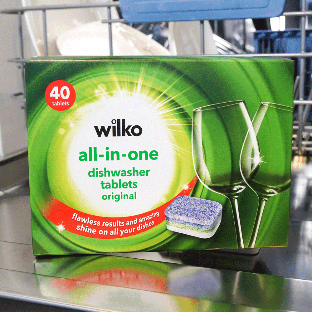
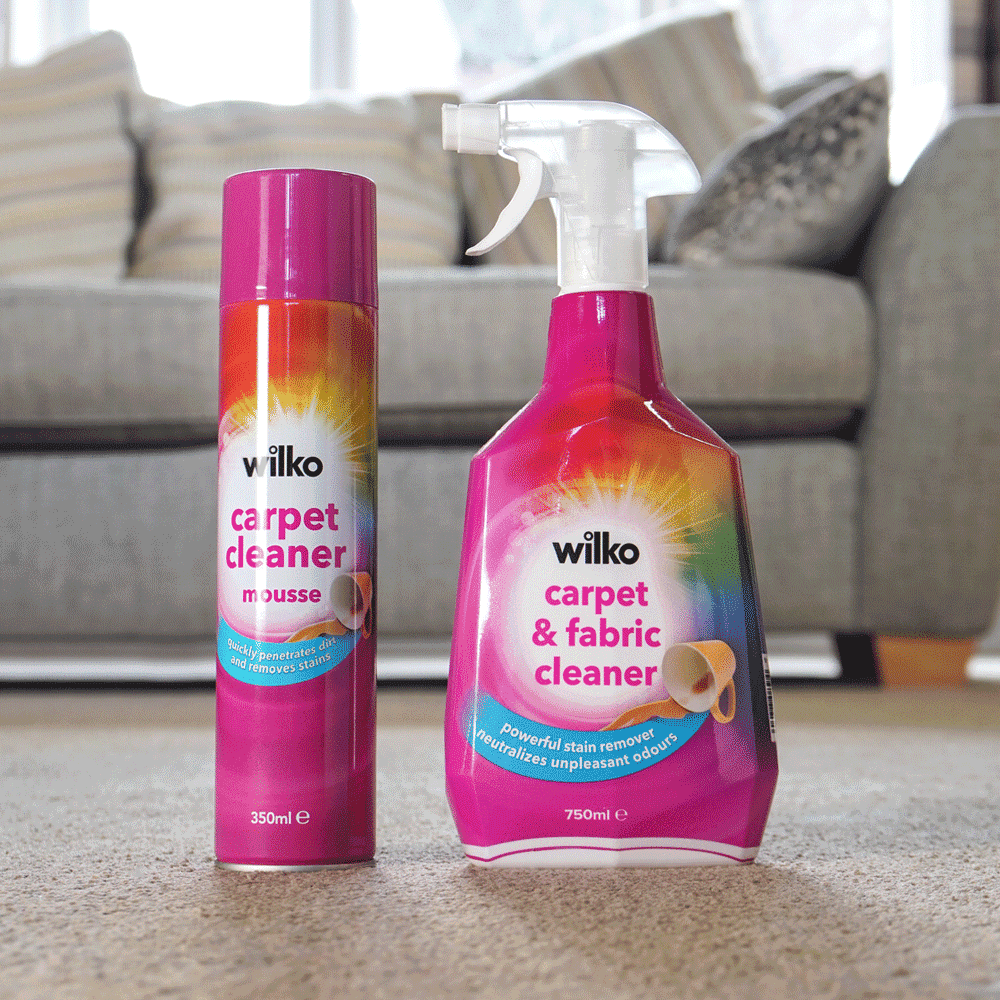
So we started with the competition, investigating how their graphics and copy worked to present a compelling picture of cleaning power. Using what we found, we created Wilko’s very own version that communicated cleaning power and affordability – which we called ‘reassuringly familiar’.
At the centre of the new brand was our ‘Burst of Clean’ graphic. This circular device, built on the Wilko ‘O’, represented the ease and effectiveness of the products. We balanced this with strong colours inspired by different fragrances and borrowed from key category cues, aligning Wilko’s products with the brand leaders. We then built a comprehensive style guide so that the wider Wilko team and suppliers could create the look consistently and with ease for all products across the store.

